Performance Measurement Made Simpler: What Do Comparative, Trend & Reference Views Tell Us?
We’re now entering season three of our Golf Market Research Center (GMRC) initiative and, while the subscriber base hasn’t grown exponentially annually, we’re both educating and learning monthly with the progressive group of owner/operators who have joined us in the journey toward deeper insights into their performance. We created GMRC in part because traditional PoS systems were lacking in comparative and trend analysis in single reports (you could run multiple reports and merge them in Excel, but who wants to do that?) along with the fact that, ultimately, what all (most?) operators would like to know is how they’re doing against their peer group in the local market or, in the case of destinations, compared to other destination markets.
On this continuing journey with our GMRC subscribers, somewhat due to the fact that we still have a small (intimate?) sample, we get interesting questions and discussion around things like “When should I look at comparative vs. trend?” and “What reference can you give us to the “outside world” and how we’re faring so far?” In this issue, I’ll share the answers to those questions and maybe, by the time we’re done, I’ll convince some number of you to participate in GMRC to see “how you look” and join the interesting, ongoing discussions:
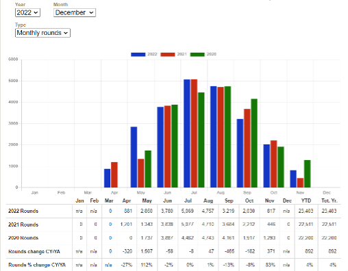
- Comparative views – Far and away the most common view in business performance reporting, this generally compares a current period (i.e. month, Year-to-Date or YtD) to the same period in a prior year. In the GMRC, our two go-two views for this are the Monthly Trend report (which shows each month and it’s counterpart from last year and the year before (so ’23, ’22 and ’21 currently) and the KPI Scorecard report (which shows comparative performance for our 7 Key Performance Indicators) for the current month and YtD vs. Year Ago (YA). I’ll provide illustrations of each in the commentary section
- Trend views – This shows the rise and fall of the % change over months, usually in the current year, which tell us whether our performance is accelerating or decelerating. Our Monthly Trend report shows these monthly figures for the current year change vs. YA, highlighting whether there’s a clear momentum trend or the change rate is as erratic as my golf game (up/down/down/up etc.). I’ll illustrate an example using % Utilization in the issue and how I (and our subscribers) read the tea leaves
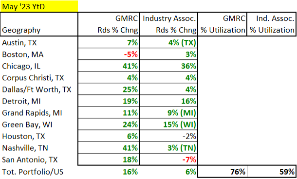
- Reference views – I’m consciously avoiding the “B-word” (Benchmarking) because I’m an analyst (and purist) and benchmarking is reserved for those situations where you have a sizeable sample, balancing to make it representative of the larger universe (i.e. by markets and facility types in our industry) and enough history of results to show that it’s stable and reliable vs. all over the sky month-to-month and market-to-market. We’re far from that, but on the journey, and I’ll provide a sneak peek at how we currently compare the GMRC portfolio performance across markets and to the general universe for rounds using May YtD public domain data
Since this is (should be?) germane to the vast majority of our monthly reader base, I’m publishing the entire issue to all of you (Link to Full Article Below). That still leaves you with a decision at the end to just absorb the learning and say, “Thanks” or joining us on the insights and action journey going forward one of three ways (all of the below also have monthly pay-go options, at a slightly higher annual rate):
1. Subscribe to the Pellucid Publications Membership for $495/yr (most comprehensive coverage & detail) – Annual subscribers get access to the following:
- Outside the Ropes monthly digital newsletter (including this issue for starters!)
- Annual State of the Industry report portfolio (PowerPoint presentation, PDF commentary report, access to Jim/Stuart video of presentation)
- Geographic Weather Impact Tracking (US, 45 regions, 61 markets) or Cognilogic for Golf Playable Hours/Capacity Rounds for individual facilities
- National Consumer Franchise Health Scorecard (expanded data and tables underlying this issue’s summary figures)
2. Subscribe to OtR, 12 monthly issues for $250/yr with a money-back guarantee if you’re not satisfied at any time during your subscription. Subscribers also get access to the historical archive of past issues (last two years) via the members-only section of the Pellucid website
3. Subscribe to Golf Market Research Center (for operators wanting a combination of insights and action tools) – In addition to an OtR subscription, you’ll get the State of the Industry presentation along with the full suite of Performance Tracking reports and weather impact services (Cognilogic for historical Golf Playable Hours/Capacity Rds, Foresight for the 60-day forecast for your facility location for Capacity Rds and daily key weather forecast variables)
Comparative reporting is the “go-to” tool, why isn’t it simple and easy in golf?
- One of the early mind-blowing revelations that Stuart shared with me 20 years ago when we started our collaboration was that, in most PoS systems, you can’t run a single page report that will tell you your rounds or revenue for the current period alongside the same period last year with the Units and % Change calculations. “Really, so how do the operators do it?” They run the current period report and export to Excel, then they run the prior period report and export to Excel, then write some merge/formulas in Excel to do the comparisons to produce something that’s relatively automated and pretty.
Twenty years later I’m sad to report that it’s not much better today, in part because a) operators haven’t demanded it and b) because the PoS providers & operators couldn’t agree on basic, universal formats. While ours also isn’t going to win any beauty contests, we agreed that one of the GMRC views has to provide this single page comparison for months and YtD and include two prior years (just for good measure and to spot anomalous years):

The above is a sample report for the year ’22 for one of our GMRC participants and here’s the storyline on what the comparative metrics tell us for the measure of Rounds Played:
- Annual performance – They finished +4% (unadjusted, not incorporating weather impact…yet) for ’22 vs. ’21 (COVID-elevated recall) or an incremental gain of ~900 rounds
- We can see that also beat the ’20 figure so ’22 wasn’t an artificial gain off a depressed comparison year (good to know)
- The journey to that 4% gain in rounds was a seesaw by month with gains in the shoulder months of May (primarily) and Nov fueling the incremental gain
We sought to do 2 things in this view to make it easier for the user to find the insights:
- Put all the relevant numbers in one view without having to run multiple reports and merge in Excel and…
- Do the relevant calculations of change in both Units and % to quickly figure out where you had the biggest jumps/drops in the absolute (Units or Rounds) and relative to the base size (% Chng)
Channeling the demigod Maui in Moana, “You’re welcome.”
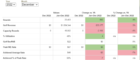
The other way we present a comparative performance view in the GMRC is the KPI Scorecard report. We’ll take that same ’22 year-end period and switch from looking at a single KPI across time to looking at all 7 of our KPIs for 2 periods (current month and YtD, we’ll focus on the latter because this is December in the northern latitudes hence the 0s in the month columns):

- As we saw in the previous graph, Rounds were up 4% for the year or ~+900
- Golf Revenue was actually down by 3% for the year (ouch, action step to investigate)
- Given those two factors, Achieved Avg. Rate must have been down, yep, -7%. This requires some investigation in that a decline in rate can be one of several things (or a combination):
- We took a price decrease vs. the previous year (not likely here, you can see that our Peak WE Rate reported by the facility was +$4/rd or a 5% increase)
- We discounted more (this could be more season passes as golfers increase their frequency post-COVID and want to convert their golf to a fixed vs. variable expense…and then they play a lot of rounds)
- The play patterns shifted, either from higher rate time windows (i.e. weekend primetime) to lower or from full (18 hole) to abbreviated (9 hole) rounds
- Exclusive to GMRC, we can see that Capacity Rounds also declined by 4%, so the gain of 4% in Played Rounds was in the face of a weather headwind
- That produces a weather-factored gain in % Utilization of 4 pts from 44% in ’21 to 48% in ‘22
- Finally looking at the “cardinal metric” of Revenue-per-Available Round (RevpAR), we see that the opposing factors of Golf Revenue down and Capacity Rounds down produced a flat even ’22 vs. ’21 on this measure. In Golf Revenue, after factoring in weather influence, they played to a draw after 12 months
Does your PoS system produce a causal waterfall report on a single page that incorporates weather impact? (rhetorical question…) Let’s now look at the 2nd critical way to view performance through the GMRC lens, trend analysis.
The trend (sometimes) is your friend.
The above Wall Street sentiment basically advises not to bet against the trend when it’s clear, consistent and persistent. The challenge is, to figure out those three things, you actually need to have good data and some tools to identify what that trend is. Let’s take a look at how :
 Pellucid
As always, we appreciate your support and partnership on our journey to help intelligent industry stakeholders make better-informed decisions, unbiased by industry dreams, hopes and “spin.”
©Copyright 2023 Pellucid Corp. All rights reserved. Quotations permitted with prior approval. Material may not be reproduced, in whole or part in any form whatsoever, without prior written consent of Pellucid Corp.


